Creating Custom Charts
You can create custom saved charts that represent a particular time slice for administrative reference. To create charts, you specify attributes such as type, time frame for reporting, and chart style, and select categories and groups from which to create the chart.
Note: To create charts, you must have View permission for Manage Report/Dashboard.
To create a custom chart:
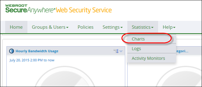
- From the Home tab, from the Statistics drop-down menu, select Charts.

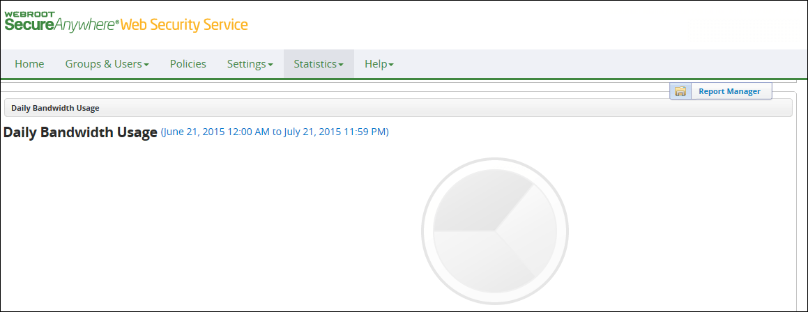
The Charts page displays.

- Click the Report Manager button.

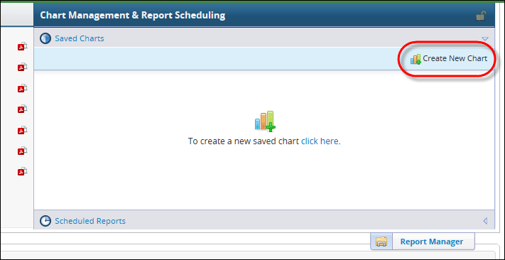
The Report Manager shows the canned charts on the left side of the page. Saved charts and scheduled reports appear in the Chart Management & Report Scheduling on the right side.

The timestamp on all charts is based on the administrator's time zone.
- Click the Create New Chart link.

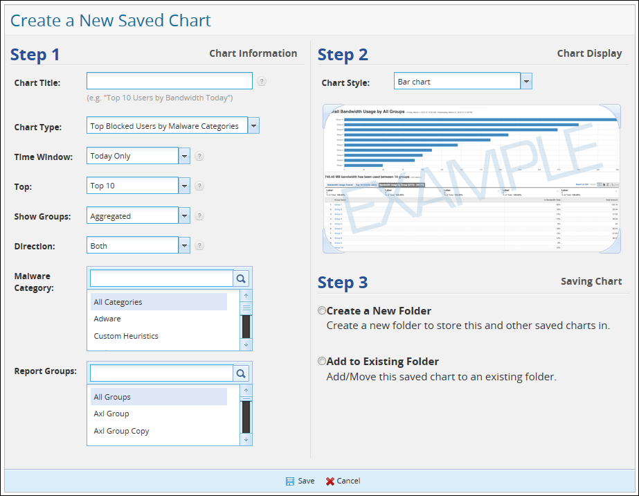
The Create New Saved Chart window displays.

- In the Step 1 section of the page, specify the attributes for this chart, which are described in the following table.
The Chart Title, Chart Type, and Time Window attributes apply to all charts, and the Top attribute applies to all Top N charts. Other attributes available depend on the Chart Type you select.
| FIELD |
DESCRIPTION |
| Chart Title |
Enter a name for the chart, up to 64 characters. This name appears in the Report Manager's Saved Charts list. |
| Chart Type |
From the drop-down menu, choose from the predefined chart types on which to base your new chart. |
| Time Window |
Select the time window for this report, from Today Only to 1 Month. |
| Top |
Choose the number of top groups or users to view: Top 10, Top 20, or Top 50. |
| Show Groups |
Select how to show groups:
- Aggregated combines results from all groups in a single report.
- Compared means that one chart is produced for each group you select, so that you can compare them. The charts are independent of each other, but run for the same timeframe and against the same x and y factors. You can select up to five groups for comparison. The Compared option works in conjunction with Report Groups.
|
| Order By |
Select the order to display by Blocked, Coached, Manual, and Total. |
| Specify Domain |
Specify the domain to include in this chart:
- All generates reports on all users in the account. This is the default.
- Including only includes domains with names that match the text you specify in the text box.
- Excluding excludes domains with names that don't match the domain you specify.
Note: You must enter a fully qualified domain name.
|
| Site Category |
Select the category to include in this chart. |
| Report Groups |
Select the groups for your chart.
- If you selected Aggregated for the Show Groups attribute, the chart reports on all selected groups as one.
- If you selected Compared for the Show Groups attribute, you can select up to five groups.
Tip: When selecting from a list such as Report Groups, you can start typing in the select box and the Report Manager populates the list with matches. If you remove your typing by backspacing or deleting it, the list is repopulated with all selections.
|
| Direction |
Select the direction to report on malware: Both, Inbound, or Outbound. |
| Malware Category |
Select one or more malware categories:
- All Categories
- Adware
- Custom Heuristics
- Malware Behavior
- Potentially Unwanted Apps
- Suspicious Behavior
- Suspicious Destination
- System Monitors
- Trojans
- Viruses
Tip: If you select multiple attributes for a chart, you can show only those you select by typing: :selected in the attribute field and pressing Enter.
|
| Specify User Name |
Select users for the malware chart:
- All generates reports on all users who are controlled by this admin.
- Including only includes users with names matching the text you specify in the text box.
- Excluding excludes users whose names do not match the text you specify in the text box.
|
| Usernames |
Specify up to five usernames to report on. |
| Specify Malware Name |
Specify the malware name for the chart:
- All generates reports on all malware.
- Including only reports on malware whose name matches the name you specify.
- Excluding excludes malware with names that do not match the name you specify.
|
- In the Step 2 section of the page, select a Chart Style - bar chart, timeline, or column chart.
The chart styles available depend on the Chart Type you select.
- In the Step 3 section, select a folder for the chart:
- Create a New Folder: Selecting this option opens the Folder Name field - enter a name for the folder, up to 64 characters. You can create and save a maximum of ten folders per Admin; this includes any saved legacy charts from a previous release of Web Security Service.
- Add to Existing Folder: For saved reports, select a folder for the report from the dropdown list.
- Click Save at the bottom of the page.
You can save up to 100 charts per admin.

